Color
Preventing barriers for people with visual impairments or who interpret color and contrast differently.
Color as information
Using color as a design element to communicate information and meaning is natural to designers and can greatly improve usability and accessibility for most. However you must take care not to exclude the significant portion of the population who cannot see color, cannot see color fully, or who may perceive color differently. This is why the WCAG advise:
Color is not used as the only visual means of conveying information, indicating an action, prompting a response, or distinguishing a visual element. [1]
Provide a fallback
To supplement the use of colors which indicate state, you should add icons and/or text labels to accommodate people who can't perceive color. The examples below show how error states indicated with color (red, yellow, or green) can be made accessible by adding icons to the associated input fields as well (an ex, an exclamation mark, or a checkmark).
Example: adding icons
An inaccessible example of using color alone to communicate necessary information:
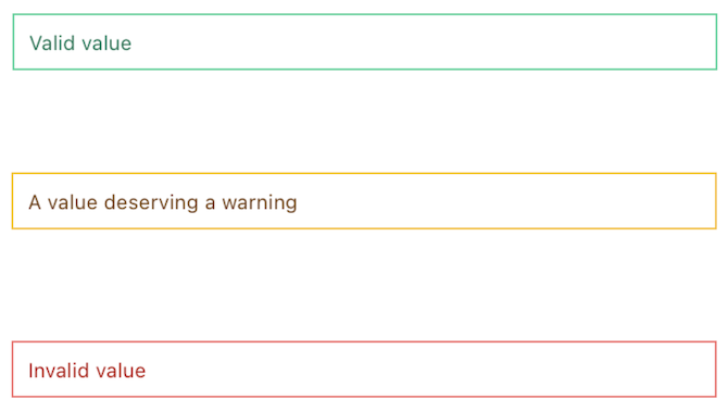
The three error states shown here are applied to text input elements. Use of color alone to indicate an error state (in red), a warning (in yellow), or success (in green) excludes users who cannot perceive color.
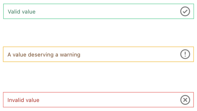
An example of providing alternative indicators, in addition to color:
By adding icons to the text input elements as an indication of error state, the color is no longer the only means of perceiving the state information, and the components are now accessible.
Example: Focus indicator
The required level of contrast for graphical objects and user interface components is 3:1 (3 to 1), which is slightly lower than the required 4.5:1 for body text. The sample below shows an unfocused button and then two differently-colored focus indicator rings. The lighter focus indicator is inaccessible, having only a 1.44:1 contrast.
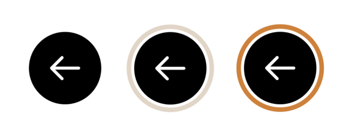
Of the two focus indicator rings shown, only the darker color is accessible, having the minimum contrast of 3 to 1 against the surrounding white background color.
Colorblindness
Those considered colorblind may only have trouble perceiving certain colors, they may perceive some colors but partially, or, more rarely, they may not be able to perceive any color at all. Below is a sample error message where color is used to communicate how to correct the problem. Users with typical color perception will see the characters "=" and "$" highlighted in red.
Here the meaning of the error message depends on color.
A condition that reduces red-green color perception affects around 1 in 12 men and 1 in 200 women. [2] This example simulates how people with this condition might experience reduced contrast of reddish colors. Notice that the information regarding the incorrect characters has become nearly invisible.
The reduced contrast in red colors makes the meaning imperceptible.
Screen readers
Another significant group of users have limited or no sight and may use assistive technology such as a screen reader or a braille display to perceive the content on your webpage. These devices do not normally communicate the style or color of text.
In the following example, the text is meant to highlight the current price of some online merchandise during a sale. Visually, the original price is presented in a lower contrast and with strike-through style via the semantic del element. The on-sale price is larger and styled in a red. These visual clues communicate to most sighted users what the original price was and what the current price is.
The meaning of the text is conveyed in part by color and style.
People who use screen readers, however, can't see the style or color of the same content. Apple's VoiceOver screen reader for example will read that same content with no indication of the deleted state of the first price as:
When read out by a screen reader, the text color and style is no longer perceptible.
At this point you may wonder if using an accessibility attribute like aria-label or aria-description would add in the missing information for screen reader users. However, on non-interactive elements such as a span, p, del, or div, [3] those attributes are not supported and screen readers will therefore ignore them.
It might be possible to add visually hidden "screen reader only" content to explain the two prices, however, this is usually considered a lesser option versus just adding regular text visible for everyone.
[Authors who rely on accessibility-specific content fail to appreciate] "the negative social implications that come with creating 'special' instructions only for disabled people." [4]
Having a separate but comparable approach to accessibility is sometimes the only option, but consider the positive force that accessibility often can be for design and implementation: when we make apply solutions for disabled users wisely we can deliver an outcome that benefits everyone.
Accessibility will not force designers to make ugly or boring products; instead, it will make them critically think, and the solutions will most likely surprise consumers. [5]
Users may override color
People with certain neurological or visual conditions find it easier to read content with specific levels of contrast between background and foreground. Forced color mode was designed to enhance the readability of webpage content by allowing the user to override the contrast and color schemes on a webpage.
Forced color mode may override all or some of the webpage colors with the user's specified colors, adjust several color-related properties, and render fixed-color backplates behind webpage text. (In cases where text is overlaid on top of images, these text backplates help improve text legibility.)
These overrides may be implemented at the operating system level, or via browser settings or extensions. Below is an example how content is presented when a Chrome browser extension has overridden the saturation of specific colors on the webpage.

The same webpage is shown twice; the example above is presented with the original webpage colors intact, the example below shows how it differs when a browser extension is in effect. The image and background colors are visibly less reddish and more greenish in the overridden example.
High contrast mode
On the Windows operating system Windows High Contrast Mode (WHCM) is a commonly used example of this type of feature and is implemented at the operating system level.
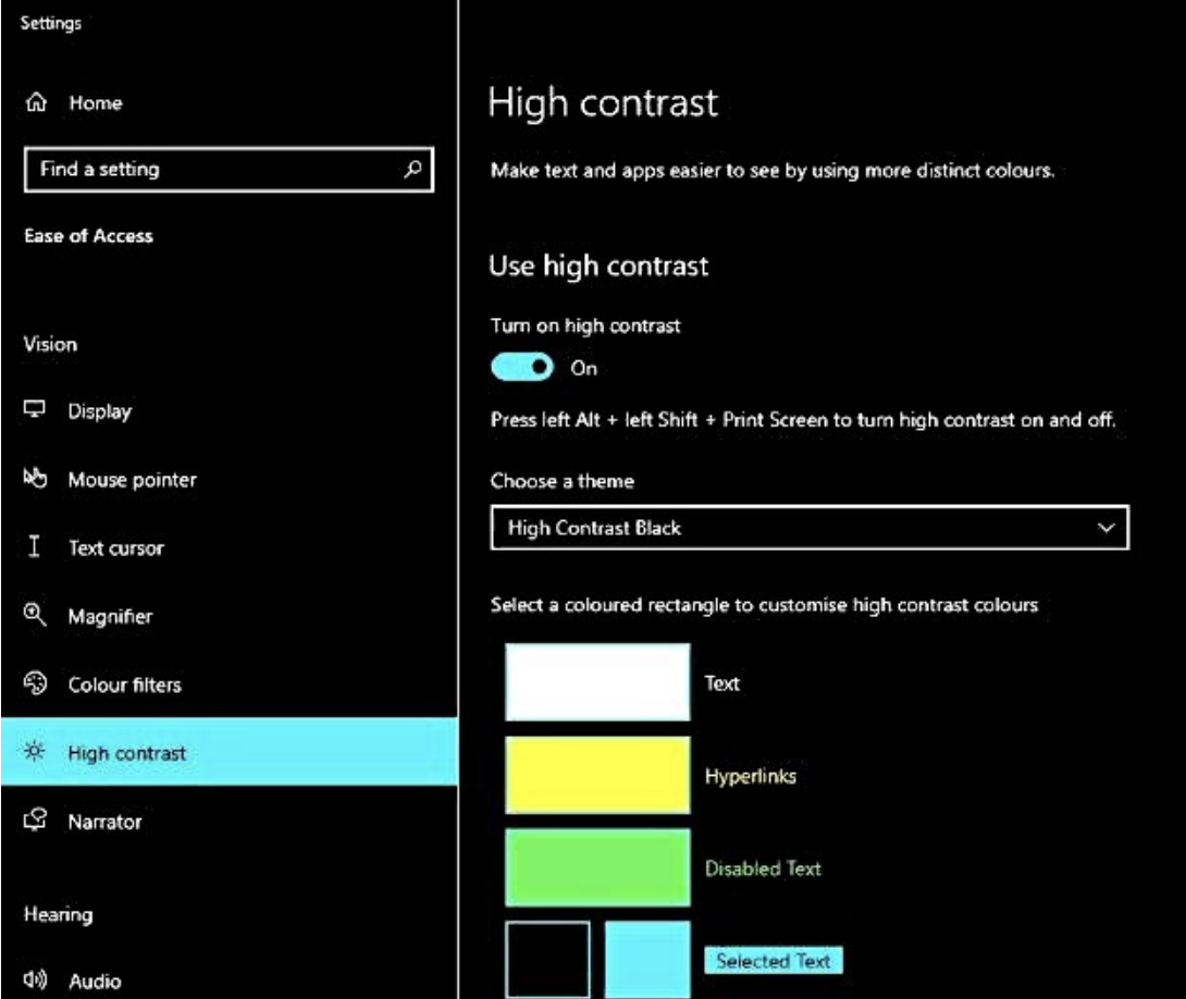
On the Windows operating system, enable High Contrast Mode by going to the settings menu. In the search bar, type "high contrast" and click the result. Click the "Turn on high contrast" toggle to turn on high contrast.
Testing your webpage in WHCM is strongly recommended; some webpage authors find it surprisingly unyielding in how it applies its high-contrast styles to elements.
WHCM also cares not for your ARIA roles, states, or properties. Screen readers will read a
<a role="button">as a button, but to WHCM, it remains a link and receives link colors. [6]
Low contrast mode
It is helpful to remember that not every override is to achieve higher contrast: some users will customize the presentation to lower contrast, or to use very specific color combinations that benefit them.
.lowcontrast {
  filter: contrast(0.8) saturate(0.6);
}

An example of the muting effect a low contrast filter used by some users can have on a highly contrasting and saturated image.
Working with forced colors
Allow SVG colors to be overridden
Forced color mode won't affect color values hardcoded within SVG markup. However if you have a simple SVG icon that uses only a single color and you want that to match the surrounding text color even in forced color mode, you can use the relative value currentcolor on the fill and stroke attributes in your SVG. This allows the color of the SVG fill to match the color of the enclosing HTML element, whatever that may be.
<svg height="24" width="24">
  <circle fill="currentcolor" cx="12" cy="12" r="12" stroke="none" />
</svg>
So if, in the default mode, the surrounding text would be rendered dark-gray then currentcolor is dark-gray. But if in forced color mode the text becomes lime-green, your svg icon will be lime-green to match.
Transparent is treated like any other color
One fact that catches developers out is that forced color mode treats the transparent value as it would any other color. This can have negative outcomes, for example if you are using transparent elements or properties as invisible placeholders to position elements on the page, in forced color mode those previously transparent placeholders will suddenly become very visible.
On the other hand you can also use this to your advantage, for example if you do want an element to be transparent in the default mode but then be visible in high contrast mode. A common example of this is when styling the focus indicator for an element. Using the usual outline css property can be problematic in some situations (for example when the focused element is non-rectangular), so developers use the box-shadow property instead. Using box-shadow achieves good visual results in the default mode, but in WHCM box-shadow is effectively removed from the presentation. This can be a problem if you've removed the outline as well by setting outline, or the outline-style to none. Instead, when using box-shadow for focus indication, leave the outline in place, but set its color to transparent.
:focus {
  outline: 2px solid transparent;
  box-shadow: 0 0 8px 2px rgba(0, 0, 0, .8);
}
This means the box-shadow will be visible on focus in the default mode, while the outline is transparent. In WHCM the box-shadow won't be displayed, while the outline's color will be overridden and thus visible.
Overriding forced colors
In rare cases the color is the information, for example if a component needs to display the options available for a custom color. Recent browsers make the forced-color-adjust: none CSS rule available for these exceptions so that the webpage author can override the forced colors for specific elements.
@media (-ms-high-contrast: active), (forced-colors: active) {
  .preserve-color {
    -ms-high-contrast-adjust: none;
    forced-color-adjust: none;
  }
}
Now any element with the preserve-color class should not be affected by the forced colors on the rest of the page.
<fieldset>
  <legend>Choose a color for your free gift:</legend>
  <div>
    <input type="radio" id="cranberry" name="color" value="cranberry">
    <label for="cranberry">
      <span class="swatch swatch-red preserve-color"></span>
      Cranberry red
    </label>
  </div>
  <div>
    <input type="radio" id="kiwi" name="color" value="kiwi">
    <label for="kiwi">
        <span class="swatch swatch-green preserve-color"></span>
        Kiwi green
    </label>
  </div>
</fieldset>
It's worth keeping two caveats in mind: forced-color-adjust does not yet have full browser support and its purpose is only for the exceptional case where color is intrinsic to the meaning of the content and it would be confusing or useless without it.
"This property should only be used to makes changes that will support a user's color and contrast requirements. For example, if you become aware that the color optimizations made by the user agent result in a poor experience when in a high contrast or dark mode. Using this property would enable tweaking of the result in that mode to provide a better experience. It should not be used to prevent user choices being respected." [7]
User preferences
Users may not go so far as to override the webpage colors completely, but may instead make their preferences known via browser or system settings and let the webpage author handle the adjustments. This setting is available to be handled within CSS by using the prefers-contrast media query. This allows you to author bespoke styles for any of the possible values: no-preference, more, less, custom, or additionally the prefers-color-scheme with possible values of light or dark. [8] An example showing some possible custom styles that could be applied if the user has indicated they prefer more contrast.
@media (prefers-contrast: more) {
  .more-contrast {
    background: #fff !important;
    border: 2px solid #000 !important;
    color: #000 !important;
  }
}
Now any element with a more-contrast class should be presented with a high contrast black on white color scheme when the user has indicated that they prefer more contrast. Naturally you can customise this however you wish.
Don't rely only on color
By now you should rightly be wary of any design or implementation that depends only on color to communicate information. We know that a portion of your audience won't be able to partly or fully perceive color and will need additional text to explain the missing meaning. Think about how that text might also be helpful for everyone.
The added text makes the meaning clear even without color or style.
Keeping track and testing
Calculators and naming conventions
Ideally your design system will define a color palette that is known to be compliant with the WCAG contrast requirements for level AA when combined with either light or dark text. There are useful tools to help with that, such as the Systematic Color Palette generator. Each color swatch clearly displays the contrast ratio, and any that fall below the minimum 4.5:1 are highlighted for you to adjust.
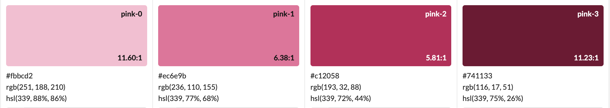
One row of the generated palette shows four variations of pink, starting with a light shade and progressing a total of 4 steps to the darkest shade. On each swatch the color contrast against either white or dark-gray text is shown: it ranges from about 11 to 1, down to about six to one.
Based on the above palette, we could display white text on a pink-2 or pink-3 button and be assured we are exceeding the minimal contrast of 4.5 to 1.
Notice that we are using a naming system that roughly indicated the darkness of each shade, in this case on a scale from 0 (the lightest) to 3 (the darkest). This can be very helpful to allowing implementors to quickly know the relative darkness and therefore the effective contrast between two colors. For example, if I had defined a palette of green and red colors named with a number between 0 and 200 to indicate the lightness, I could predict that the relative contrast between red-50 and green-50 will practically be none. Similarly a lighter green100 on a darker green50 with a difference of only 50 will be inaccessible.
These two samples show foreground and background differentiated by hue (red versus green) and shade and tint (darker and lighter). In both cases the contrast in the foreground and background is insufficient.
In these samples greater difference in contrast is applied, making the colors accessible.
Using a similar naming convention that makes it obvious which colors could be accessibly used together could be very helpful.
Testing tools
Ensuring sufficient contrast between two colors isn't something you want to guess at, and you don't need to: Use a free tool like the WebAIM Color Checker to get the precise difference. Remember that while a ratio of at least 4.5 to 1 for body text, or 3 to 1 for larger text and interactive elements is the minimum, this is a limit not a target. More comfortable ratios such as 8, 9, 10, or even higher are better for many users.
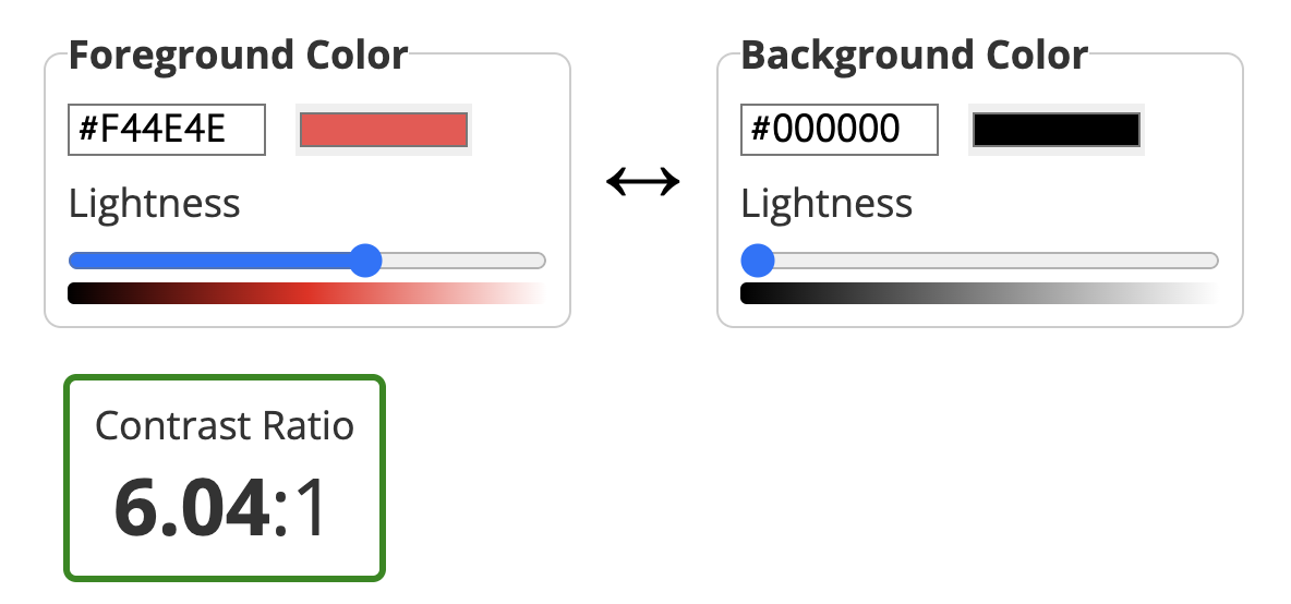
The contrast calculator allows you to enter two color values, in this case a medium red foreground and black background. It show that the contrast is just over 6 to 1.
Checkpoints for the Tester
- Ensure that the contrast ratio between foreground (text) and background colors is at least 4.5:1 for normal text and 3:1 for larger text. (For example by using a tool like the WebAIM Contrast Checker). Include checks for things like the keyboard focus indicator.
- Ensure that your core content is perceivable and understandable without color, for example by using a filter to remove color (rendering in grayscale only) or to simulate common color perception conditions. Include checks using High Contrast Mode.
- Ensure that graphs or controls where meaning is provided using color (e.g. where errors are only indicated by a change to red color) have alternative means of communicating the same meaning.
Notes and references
Use of Color Web Content Accessibility Guidelines (WCAG) 2.1 back to reference 1
Colour vision deficiency (colour blindness), NHS UK back to reference 2
Not so short note on aria-label usage - Big Table Edition, Steve Faulkner back to reference 3
aria-label is a code smell, Eric Bailey back to reference 4
Accessible design benefits everyone, Canvs Editorial back to reference 5
Quick Tips for High Contrast Mode, Sarah Higley back to reference 6
forced-color-adjust, MDN Web Docs back to reference 7
Use a light or dark appearance on your Mac, macOS User Guide back to reference 8