Focus
Presenting and managing focus in an accessible way.
Keyboard navigation
Some users find navigating and interacting with a webpage via a keyboard easier than operating a mouse to control an onscreen pointer. Very experienced users, for example, may find keyboard navigation more efficient than a mouse, but for people with motor-control disabilities, such as hand tremors, joint injury or disease, or limb differences, using a mouse may be difficult or impossible.
People using alternative input devices such as a switch control [1] or voice-controlled input may also act as "keyboard navigators" when those devices are configured to translate their input into keyboard combination equivalents.
Whereas a person controlling an onscreen cursor will move that cursor around a page freely and activate webpage controls by clicking the buttons on their mouse, a keyboard navigator uses key combinations or swipe gestures to advance a digital focus state (via a virtual cursor) along an ordered series of focusable elements encoded into the webpage. By default, focusable elements are links, buttons, details elements, audio and video controls, elements with a contenteditable attribute, and form controls: any element the user needs to interact with or provide input to. Applying these elements semantically is always the simplest way to ensure that focus works and works as expected.
Tab order
A simple way to easily move focus with a keyboard is by enabling tab-key navigation. [2] Use the tab key to move forward and the shift+tab combination to move backwards. A visible onscreen focus indicator should make it clear which element currently has focus; it should move in an expected direction, from left-to-right and top-to-bottom (RL-TB) for readers of RL-TB languages.
You can use a browser extension to visualize the focus order of elements on your webpages quickly. [3] In the example below, it's apparent that a hidden element (the Close button of an unopened menu) is inadvertently in the focus order between the last navigation link and the search form.

A keyboard navigator will need to press the TAB-key eight times to advance focus to the "Search" element.
Changing the order
Changing the natural tab order of focusable elements is possible using the HTML tabindex attribute. Below are some types of values you can use:
tabindex="0": When applied to non-focusable elements, it allows them to become focusable as if they were a focusable element and part of the natural tab order of the webpage.tabindex="-1": When applied to non-focusable elements, it allows them to become focusable via JavaScript's.focus()method.
Setting the tabindex to any number other than 0 or -1 sets that number as the explicit tab order of the element on the webpage. This creates confusion and barriers for users who can see the screen but navigate by the keyboard. Any element with a positive tabindex will receive focus before other focusable elements with no tabindex value or a tabindex of 0. This likely results in a keyboard tab order different from what is visibly displayed.
Keyboard traps
Keyboard traps occur when a user can move focus into an element on a webpage via the keyboard (or focus moves into that element automatically), but the user can not exit that element via the same mechanism.
"If keyboard focus can be moved to a component of the page using a keyboard interface, then focus can be moved away from that component using only a keyboard interface... " [4]
A typical example where focus movement should be intentionally limited is when presenting a modal dialog. Programmatically moving focus to the dialog and requiring the user to respond, for example, by activating an "I agree to the legal terms" button before continuing, is an appropriate pattern in some cases. However, it must be possible for the user to continue using only the keyboard.
Focus indication
"Any keyboard operable user interface has a mode of operation where the keyboard focus indicator is visible." [5]
A visible indication of which element currently has focus is required to prevent barriers for users who can see the screen but rely on the keyboard to navigate. For this reason, you must not hide or disable the browser's ability to display a visible focus indication, typically based on the CSS outline property.
Default styles
Unless you actively disable the CSS outline property, the browser will display a default indicator to show which element currently has focus; each browser is free to use whatever color and style they choose.
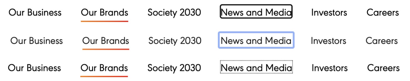
Here the navigation link "News and Media" has focus in three different web browsers. This shows the visual differences of the default focus indicator among those browsers: Microsoft Edge, Apple Safari, and Mozilla Firefox.
You might think the browser knows best when it comes to accessibility, but this responsibility belongs to the webpage designer. This is true for two reasons. Firstly the default style won't consistently match the brand and aesthetic of the rest of the page. Secondly, the usefulness of a focus indicator is in how perceivable it is: if it cannot be seen among the other elements on the page, it is effectively useless.
The examples below show you linked images in a focused state: they both have visible focus indicators applied, but one is very difficult to see due to the color of the element it is applied to.

Comparing the visibility of Microsoft's Edge default focus indicator, a thin black outline around the linked image, versus a custom styled outline styled in gold and offset slightly from the image.
The focus outline must have sufficient contrast with the surrounding elements to stand out and be easily found by the user. The standard for an accessible style is generally: [6]
- It must display a solid outline that encloses the focused element, or the indicator must have an area equivalent to a 4px thick line along the shortest side of the focused element
- It must contrast at least 3:1 when changing from the focused to unfocused state, or the indicator must have a thickness of no less than 2px
- It must contrast at least 3:1 against adjacent colors
A thin black outline (the default in Microsoft Edge) around a dark image would be difficult for most people to spot. One way to use a more deliberate custom style with greater contrast is shown below:
a:focus img {
  outline-color: goldenrod;
  outline-style: solid;
  outline-width: 3px;
  outline-offset: 2px;
}
Visible when focused
Be aware that merely styling a focusable element so it is no longer visible, will not automatically make it unfocusable. For example, suppose an element is positioned off-screen and marked with aria-hidden="true", making it not visible on the screen and unavailable to the accessibility API. In that case, moving focus to that element or any focusable elements within it may still be possible. This will confuse sighted users, who will only perceive that the focus indicator suddenly disappears when it moves to an off-screen element.
One solution is to ensure that it becomes visible when the hidden element receives focus. So-called skip links are commonly implemented using this pattern. In the TailWind CSS framework, this can be achieved by adding two screen reader only classes:
<div tabindex="0" class="sr-only focus:not-sr-only focus-within:not-sr-only">
  I become visible when I get focus.
  <a href="#content">Skip to Content</a>
</div>
If you want to hide a focusable element from keyboard focus temporarily, you can add an HTML tabindex="-1" attribute to them when they become hidden and remove it when they become visible again.
Not showing focus
Generally speaking, you shouldn't prevent a focus indicator from being shown; however, there is an exception where showing the focus indicator might be considered unexpected. Modern web browsers will only show their default focus indicator on a button or link when the user moves focus to it with the keyboard; they do not apply the indicator when a user clicks a button using a mouse, for example. If you set your own outline styles, however, you may be surprised to see the focus indicator now appears regardless of how the focus is moved to a button or link. You can imitate the browser's native convention by adding a CSS rule to hide your outline whenever the browser would not usually show an outline:
.fcs:focus,
.fcs:focus-visible {
  outline-color: goldenrod;
  outline-style: solid;
  outline-width: 3px;
  outline-offset: 2px;
}
.fcs:focus:not(:focus-visible) {
  outline-color: transparent;
}<button class="fcs">A button with styled focus</button>
<a class="fcs" href="#">A link with styled focus</a>In the demonstration below, the button with default focus style and the button with custom focus styles should now behave the same when receiving focus by mouse or keyboard. This is accomplished with the somewhat convoluted :focus:not(:focus-visible) selector. To explain, the :focus-visible pseudo-class [7] matches when an element has focus, and the browser determines that it will show a focus indicator. When combined with :focus and :not pseudo-classes, the entire selector will apply whenever an element has focus, but the browser determines it will not show a focus indicator. In that case, we set the outline color to transparent. [8]
Consider High Contrast Mode
The outline CSS property is the most reliable way to apply a focus indicator style. Other CSS properties like background-color or box-shadow should be avoided as ways to indicate focus because they may be removed if a user has Windows High Contrast Mode activated.
Checkpoints for the Tester
- Unsure that all interactive elements on the page, including links, buttons, form fields, and menus, can all be accessed using only the keyboard. For example, use the tab key to skip forward to the next focusable element, the shift+tab keys to move backward, and the enter or space keys to activate them. You may need to use the arrow keys to move amongst groups of elements, like radio-button elements or menu items.
- Ensure that each interactive element on the page shows a visible focus indicator (such as a colored outline ring) that highlights the element when it receives keyboard focus. Check that the focus state is clearly visible and has adequate contrast to be distinct from the surrounding content.
- Ensure the keyboard navigation order follows a logical and intuitive structure. The keyboard navigation order should track the visual order of the content and not jump unexpectedly or skip any interactive elements.
- Ensure that it is not possible to focus on an element that is not visible once it has focus.
Notes and references
Video, Christopher Hill, YouTube back to reference 1
Use your keyboard like a mouse with Mac, macOS User Guide back to reference 2
The example uses the Taba11y web extension for Chrome. back to reference 3
Understanding SC 2.4.7:Focus Visible (Level AA), WCAG 2.1 back to reference 5
Understanding Success Criterion 2.4.11: Focus Appearance (Minimum), WCAG 2.2 back to reference 6
The
:focus-visiblepseudo-class has very good browser support. back to reference 7Using a
transparent"color" for the outline instead of simply removing it means it will still work in Windows High Contrast Mode. back to reference 8