Typography
Communicate with type in ways that do not create barriers for people with visual impairments, learning difficulties, or other reading conditions.
Summary
The legibility of every web component that includes text is affected by the design and implementation of web typography. Users may be excluded from content based on how typographic features are implemented.
Typeface
When choosing a typeface to use with body text, select a typeface that emphasizes clarity and legibility. Using a decorative or stylized typeface should be limited to the display of a logotype or a text-based decoration.
The traits that make a typeface more or less readable can be difficult to isolate, identify, and measure. The list below [1] lists the factors that must be considered when selecting a typeface.
- Use a typeface appropriate to your audience and the organization's brand.
- Avoid imposter letter shapes designed to be very similar to other letter shapes.
- Ensure there is no mirroring.
- Letters should be easily distinguishable from one another.
- Humanist typefaces are generally more legible at smaller sizes than grotesque typefaces.
- Ensure the typeface has adequate letter spacing.
- There should be a visible difference between capital height and ascenders.
- Test the suitability of any typeface/font in context.
Be consistent and stick to a small number of typefaces, two or three, for example.
Dyslexia-friendly typefaces
Dyslexia is one of the reading difficulties most commonly thought to be affected by the choice of typeface. Several typefaces have been developed and marketed as better for dyslexic readers, but the research data around those claims are largely anecdotal.
In one of the few large quantitative studies that measured the entire range of traits that affect readability across several popular typefaces, including those specifically marketed as being better for readers with dyslexia, the evidence was decidedly mixed. Only about 20% of the test subjects identified as having dyslexic traits preferred a dyslexia-friendly typeface. [2]
This result was confirmed by other studies that measured the effort and effectiveness of reading using different fonts.
"...font types impact the readability of people with dyslexia. Good fonts for people with dyslexia are Helvetica, Courier, Arial, Verdana, and CMU, taking into consideration both reading performance and subjective preferences." [3]
This suggests that the traits that make a typeface preferable to readers are more complex than letter shapes. For this reason, it is essential to do user testing with your audience, including those with reading difficulties, before deciding on a typeface.
Line length
Body text should be kept to a line length that allows for comfortable reading.
"...long lines of text are typically perceived by users as intimidating and overwhelming. As a result, users faced with overly long lines of text are more likely to avoid reading the text." [4]
The ideal line length will naturally be relative to the font size used. Commonly accepted recommendations say to aim for between 50 to 70 total characters per line [5] (including spaces and punctuation), equating to between 10 to 18 words per line.
"If the eye must traverse great distances on the page, the reader is easily lost and must hunt for the beginning of the next line. Quantitative studies show that moderate line lengths significantly increase the legibility of text." [6]
This advice should always be applied to blocks of text on larger screens. Exceptions can be made to allow shorter-than-ideal lines in exceptional circumstances, such as block quotes, asides, and call-outs. And there may be times when text lines must be wrapped to less-than-ideal lengths to maintain a large-enough font size on smaller screens.
Controlling the line length of a web element will require taking into account the context of that element, too: margins, padding, and min and max widths of any container elements, for example, will all have an effect. You can eliminate at least one of those variables from your calculations, the font size, by specifying the maximum width of your text container using the ch unit. This will allow you to set line length according to the number of characters displayed.
.card .card__body {
  max-width: 70ch;
}
By definition, a single ch unit is equivalent to the width of the "0" (zero) character in the typeface and font size used to render it. So by setting an element's max-width to 70ch, we limit the length of a line in that element to no more than seventy "0" characters.
Font size
The Web Content Accessibility Guidelines (WCAG) do not specify a minimum font size for the web. This is likely because no single size will be exactly right for everyone, for every font, or every circumstance. Two fonts displayed at the same point size may appear relatively larger or smaller than each other due to differences in their x-height, em-square, and baseline position values.
There is a range of other variables to consider, such as the distance from the reader to the screen, the screen size, and the screen resolution. A font size large enough for a desktop monitor may not be adequate for a handheld device.
Choosing the best font size is especially important for body text, as multiple typographic characteristics conspire to create a good or bad reading experience. A value of 16 pixels (or 12 points) is generally considered the minimum size for the readability of body text; this will be sufficient for most people with typical vision or minor vision problems. Only supplemental text such as logotypes and tangential, non-essential content should use font sizes smaller than the body text.
Users must not be prevented from overriding a webpage's font size with adjustments they may prefer or require.
Use size to indicate hierarchy
Make headings visually stand out so readers can quickly scan the webpage to see how it is organized. Using a larger text size for headings, between 2.5 and 1.5 times the body text size, as well as increased font weight or contrast, will make each section easier to find and navigate.
Responsiveness
It is common practice to implement the layout of a webpage so that the elements reflow to accommodate different viewport sizes. By collapsing tangential elements, such as headers or navigation, or resizing images at smaller breakpoints, you can keep the core content of the webpage readily visible.
Users may trigger this reflow by resizing their browser window, changing the orientation of their device, or magnifying all page elements within a fixed-size viewport using Page zoom. Reflowing content should retain core information and functionality, even as the content is enlarged by up to 400%. And horizontal scrolling should not be required for pages designed to scroll vertically, even at widths down to 320px. [7]
Do not create barriers for users who choose to or need to apply adjustments to how they view text. People with low vision may:
- Zoom the page, enlarging all elements on the webpage using the zoom-in gesture or key combination in the browser.
- Resize the text by modifying the browser settings or applying a user stylesheet to enlarge only the text on the webpage.
- Use screen magnification, software that enlarges the screen display on the computer or mobile device screen.
Page zoom
Page zooming is supported by practically all browsers and devices, using gestures, key combinations, or settings. All elements appear larger when a page is zoomed to greater than 100%, and this can be a helpful solution when users need to magnify an entire webpage to make it more perceivable.
Certain HTML meta tags will disable the page zoom feature. A "viewport" meta tag that includes the user-scalable=no key/value in the content attribute creates a barrier for users who need to use page zoom. This unnecessarily limits users and must be avoided. An accessible meta tag is shown below:
<meta name="viewport" content="width=device-width; initial-scale=1.0; user-scalable=yes;">Text resize
Browsers such as Chrome and Firefox have preference settings [8] that allow the user to override the size of just the text of a page, leaving all other elements displayed at their default sizes. This is separate from any page zoom adjustment and applies to all websites and pages displayed in the browser, whereas using page zoom only affects the single website where it is changed.
The user should be able to resize body text up to 200% [9] of its original size while keeping all text visible and fully readable without clipping or overlapping.
/* do not clip text that overflows a fixed container */
.card .card--body {
  width: 300px;
  height: 200px;
  overflow: hidden;
}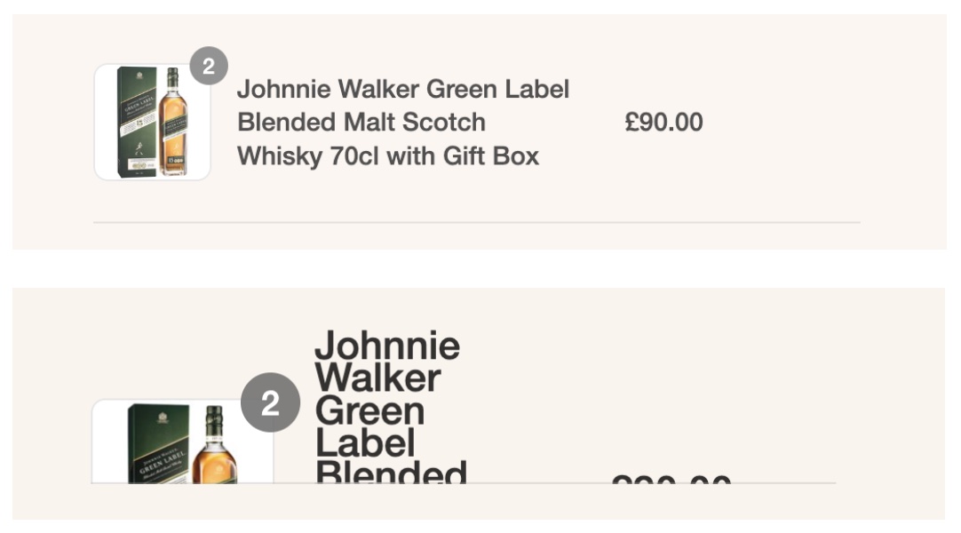
An example of inaccessible text in a shopping cart that has become unreadable when resized to 160%. Most of the visible details of the purchase are clipped when they overflow their fixed-size container element.
Units can prevent resize
Text resizing is prevented in many browsers for elements styled with an absolute-sized unit such as cm, mm, in, pt, or px. Contrast that with the em unit, a relative-sized unit originally based on the size of the uppercase letter "M" character in the typeface used. For example, in 12-point type, an em is 12 points, and in 60 point type, an em is 60 points. Confusing the matter, however, an element's em scale is also relative to the font size of its parent elements. [10]
The rem unit is like an em, but it is always relative to the size of the document's root element (the top-level, <html>, element of a webpage). If the root element doesn't have a font size assigned, then the browser default, typically 16px, is used (although the user may override this). Using the rem unit, the size is always calculated relative to the root element.
html {
  font-size: 62.5%; /* of 16px by default = 10px */
}

h1 {
  font-size: 2.4rem; /* 2.4 times the root size = 24px */
}

.small {
  font-size: 1.2rem; /* equivalent to 12px */
}
Screen magnification
In contrast with Text Zoom and Resizing Text, the Screen Magnification setting [11] simulates the view you would have if you were to look at your screen through a magnifying lens: everything on the screen being magnified will appear up to 64 times larger, including the browser menus and other OS controls. Unlike Zoom, Screen Magnification will not trigger responsive layout changes. Just like a handheld magnifying lens, the user will only see a limited portion of the screen at any given time and must move the magnifier across and around the screen to see it all.
When designing for screen magnification, do not assume that the user can see all of the screen at once. When text appears in one part of the screen in response to an interaction in another part, the new text may be unseen by a screen magnification user.
A screen magnification user will naturally drag their cursor around the screen to see all parts of the webpage. You should not require the user to hover over one specific element to reveal the content or hide it whenever they move their cursor away.
Font weight
Avoid using light or thin font weights for body text. Even at maximum contrast, delicate letter shapes can be difficult to read at body text sizes by people with low contrast perception. Choose a regular font weight for the body text.
It's important to remember that users can adjust font sizes and typefaces through their browser settings. It's the layout's job to adapt to such restyled text and ensure that it isn't cropped or overlapping with nearby content, even if the text is rendered slightly wider.
Example of overly light font weight
The following examples show the relative legibility of text rendered with the same color contrast but different weights. The top sample uses an extra light weight of 100, while the bottom example uses a regular weight of 400.
Spacing
Intra-letter spacing
Studies show that when letter spacing (also known as "tracking") is overly tight, it can lower users' reading performance. [12] Choosing a typeface with comfortable spacing will enable readers to scan your text more easily, quickly, and accurately.
The ideal letter spacing will depend on the typeface, font weight, and font size. Generally, the heavy or smaller-sized text will benefit from looser letter spacing than lighter or larger-sized text.
Intra-line spacing
You should use a line height between 140% and 200% to keep the text density sparse enough for readability and accessibility. This may require trial and error: each typeface has a unique combination of x-height, ascender, and descender size that affects the appearance of line spacing.
Extra space should be used to separate paragraphs visually. Use enough extra space to clarify the separation of paragraphs: make sure there are at least 1.5 times as much white space between paragraphs as between text lines. [13]
Margins
Margins create visual separation and grouping. When one element introduces, describes, or otherwise conceptually links to another, it's helpful for the related elements to be visually connected. For example, margins should be used to group a heading with the text it introduces visually, lowering ambiguity and cognitive dissonance barriers for readers. Apply at least 1.5 times the margin around the related elements as is visible between them.
Allow adjustments
There must be no loss of information or functionality when users need or prefer to override page styles to a reasonable degree: ensure that your webpage is still fully usable when paragraph spacing is set to 2 times the font size, line height, and spacing at 1.5 times the font size, word spacing at 16% and letter spacing at 12% the font size. [14]
Alignment and justification
For left-to-right languages, use a left-aligned layout of body text with an unjustified (ragged) right edge; do not fully justify text. [15] Fully justified alignment of text is problematic for many readers because it creates uneven gaps between characters and between words. These flowing patterns of whitespace can be very distracting for some readers.
Hyphenation
Effective hyphenation becomes more critical when displaying text in narrow columns. You may not see the need at regular font sizes, but in cases where the user overrides font size, creating wider words in a fixed space, hyphenation becomes critical.
If you operate a multilingual website, you should be aware that browsers are unreliable when hyphenating across different languages. If in doubt, you can manually specify where hyphens should appear using the invisible ­ entity (representing a soft or syllable hyphen, abbreviated SHY) in the text content yourself.
Do not disable hyphenation, especially when applied to fully justified text passages.
Example of hard-to-read justification
By setting the CSS hyphens property to none, this stylesheet makes the mistake of preventing any hyphenation. This, combined with the fully justified alignment and relatively narrow column width, results in a hard-to-read block of words. [16]
/* do not fully justify body text, do not disable hyphenation */
p {
  hyphens: none;
  text-align: justify;
}
Result of poorly justified text
Notice the awkward gaps created by the layout resulting in distracting visual rivers and pools of whitespace. This makes reading difficult in general but is significantly disabling for people with reading difficulties.
Example of more accessible justification
Setting the CSS hyphens property to auto allows the browser to decide when and where to add hyphens.
p {
  hyphens: auto;
  text-align: left;
}
Result of better-justified text
The browser will automatically optimize whitespace, and the text should visually flow along each line from one to the next.
Language direction
The HTML lang and dir attributes relate to how justification and alignment are applied. It can also affect how the screen reader and text-to-speech software interprets and pronounces the text it is speaking.
When authors specify the correct natural language of content, user agents, including assistive technologies, can present text more accurately. Screen readers can load the correct pronunciation rules and braille tables for languages. [17]
When creating content for a multilingual audience, ensure that the document root element at least has a base language and direction specified. This will ensure that your lines of text are rendered correctly on all devices. Don't assume that the browser will correctly guess the direction from the language; it often won't. [18]
For short exceptions like a single paragraph rendered in a different language, Farsi, for example, override those attributes on that section: <p lang="fa" dir="rtl">.
Text styling
Using style judiciously to highlight and draw attention to specific words is an excellent way to add meaning and clarity to the text. Be sparing and consistent in your application of these styles. Avoid long passages of italicized, underlined, bolded, or all-caps text. In body text, these treatments can make reading uncomfortable and difficult.
Text contrast
Body text must be presented with a contrast ratio of at least 4.5 to 1. Large text (at least 18pt or 24px) or very heavy text may have a lower contrast ratio of at least 3 to 1. Logotypes, incidental text, or purely decorative text have no contrast requirements. [19]
Web browsers will default to displaying black text on a white body element. Those sensitive to very high contrast may find this difficult to read for long passages. Setting the body text color to dark gray and the background color off-white is a reasonable compromise.
It is impossible to choose a color combination that works for everyone; some users will need or prefer custom color schemes. Check that your webpage is still usable with custom color schemes applied in the system or browser settings. [20]
"...some people need low brightness, especially for backgrounds. Some people who need low brightness for backgrounds also need low brightness overall and thus need low-brightness text. Other people need high contrast between text and background, including many older people who lose contrast sensitivity from aging. Some read better with dark text on a light background." [21]
Examples of high-contrast text
Compare the two examples. The first uses black on white and results in very high contrast.
The second example uses dark gray on off-white, resulting in a more comfortable contrast.
Example of a user-defined override
This custom stylesheet shows one way a user may override the website's default.
body * {
  background-image: none !important;
  color: #000 !important;
  background-color: #fff !important;
}
Checkpoints for the Tester
- Ensure that the body font is large enough to read comfortably. For most fonts, ensure a minimum size of 16px for body content.
- Ensure a line length that promotes comfortable reading. At most, 60 to 75 characters per line are acceptable and aim for about 65 characters per line. Shorter lines are permitted for text, such as captions, marginal text, and forms.
- Ensure that the chosen body copy typeface is legible. Refer to the list of factors in this guideline.
- Check the document headings to define the content's hierarchy visually. Styles should allow the headings to stand out when the page is quickly scanned.
- Ensure a line height that can be comfortably read in relation to the font size. Body copy should be at least 1.5, headings about 1.3, and captions or short lines about 1.3.
- Ensure that the body copy is not fully justified. In languages read left-to-right, the copy should be left-justified, for example.
- Ensure that the text weight of the body copy is not too light to make it hard to read; a font weight of at least 400 is required for most fonts.
- Ensure that the font size of the body text can be overridden by adjusting the browser settings (if available).
Notes and references
Quoted from A Guide to Understanding What Makes a Typeface Accessible, Gareth Ford Williams back to reference 1
Presentation (video) Don't Believe The Type! - axe-con 2021, https://www.youtube.com/watch?v=h8IOqUl1zII back to reference 2
Good Fonts for Dyslexia, Luz Rello and Ricardo Baeza-Yates back to reference 3
Readability: The Optimal Line Length, https://baymard.com/blog/line-length-readability back to reference 4
Typographie: A Manual on Design, Emil Ruder back to reference 5
Web Style Guide - Basic Design Principles for Creating Website, Patrick J. Lynch and Sarah Horton back to reference 6
Understanding Success Criterion 1.4.10: Reflow, WCAG 2.1 back to reference 7
In Chrome go to Preferences > Appearance > Customize fonts. In Firefox, go to Settings > Language and Appearance, remembering to click the "Zoom text only" checkbox. back to reference 8
"The working group feels that 200% is a reasonable accommodation that can support a wide range of designs and layouts and complements older screen magnifiers that provide a minimum magnification of 200%." Understanding Success Criterion 1.4.4 Resize Text (Level AA), WCAG 2.1 back to reference 9
The Elements of Typographic Style Robert Bringhurst back to reference 10
In Windows, go to the Magnifier setting under the Ease of Access section in the Windows control panel. back to reference 11
Extra-large letter spacing improves reading in dyslexia, Zorzi, Barbiero, Facoetti, Ziegler back to reference 12
Design Guidelines for Web Readability, Aliaksei Miniukovich, Antonella De Angeli, Simone Sulpizio, Paola Venuti back to reference 13
Understanding Success Criterion 1.4.12: Text Spacing, WCAG 2.1 back to reference 14
Success Criterion 1.4.8 Visual Presentation, WCAG 2.1 back to reference 15
Sample text from The Guardian, Move over, George Orwell -- this is how to sound really clever, Gary Nunn back to reference 16
Method: HTML lang attribute indicates the language of text, WCAG 3 Methods back to reference 17
Internationalization Best Practices for Spec Developers, https://www.w3.org/TR/international-specs/#bidi_lang back to reference 18
Contrast (Minimum), Understanding WCAG 2.0 back to reference 19
Accessibility Requirements for People with Low Vision, W3C Editor's Draft 04 back to reference 21